(I'm going to try and keep this one brief ...)
Many readers hold the charming misconception that authors not only write their books, but are responsible for the size, shape, texture, flavour, and appearance of the finished physical object.
(We're talking physical books here, not ebooks. That's yet another opportunity for discourse that I'm going to eschew for now.)
Here's the reality: as an author, I am required — per contract — to supply the publisher with a manuscript of approximately the correct length, on roughly the correct subject matter, that is substantially free from factual errors and libelous or criminal statements. I'm also required to participate in the editorial process. And I can suggest a title. That's all.
The title of the published book will usually conform to the author's suggestion, except when it doesn't. Reasons why the publisher might change it include: the author's idea of a title is going to repel readers, the editor has a better idea, or the publisher's list contains another book with a too-similar title and confusion will arise.
For example: my novel "Singularity Sky" was originally titled "Festival of Fools", but right after my editor at Ace acquired the North American rights one of their other editors published "Ship of Fools" by Richard Paul Russo. It was felt that two "... of Fools" titles on the front list at the same time would be a Bad Thing, so we haggled over a new title (and my editor wanted the S-word in it "because the Singularity is hot right now").
For another example: my short story collection "Wireless" was originally titled "Palimpsest" (after the novella it contains), but Catherynne Valente's novel "Palimpsest" came out right after I submitted the manuscript: although it was with a different publisher, we were, again, worried about the potential for confusion.
The confusion doesn't emerge between authors and their readers, but among the overworked staff at bookshops and wholesalers, or between the marketing department of publishers and the acquisitions managers at the big book chains. Every editor's nightmare is that their hot new novel is, through a namespace conflict, going to be confused with yesterday's tired midlist title by the buyer at Barnes and Noble or Borders, who will in consequence order only half as many copies. It may or may not be a nightmare with reality lurking behind it, but who wants to take that risk?
The author's name on the published book is probably safe. At least, there's a clause in my contracts that says they're supposed to attribute authorship to me, myself, and I, unless otherwise mutually agreed. It sometimes happens that authors who are in a spiral of diminishing bookstore orders are asked to start up a pseudonym (presumably to defeat the evil moustachio-twirling opera-cloak-wearing inventory computers who are persistently short-ordering their stock, and who can be confounded by the sudden appearance of a middle initial). But this is a big step, and it doesn't happen without heart-felt discussions between the author and their editor and/or agent.
(Full disclosure prompts me to reveal: my Merchant Princes books were nearly sold under a pseudonym, because of the degree to which they diverged from my other fiction. What finally stopped us going that way were the points that (a) I didn't need a new identity at that time, and (b) if either fiction track suddenly took off, selling lots of books, having them under different names would prevent follow-on sales going to the other.)
The book cover is not the author's job. In fact, the major imprints all have in-house book design departments with art directors to commission paintings, external contracts with professional photographers to commission back-flap author photos, and so on.
The job of the cover is to make a shopper pick the product up. Retail psychology studies indicate that shoppers are more likely to buy a product if they physically handle it, and this is as true in bookstores as it is in grocery or electronics stores. The cover design will therefore ideally be distinctive (to stand out from the crowd), colourful (to contrast with the crowd), and aesthetically appealing (ditto). Unfortunately these are all culturally variable and highly subjective. Fashion in book design is radically different between the USA and the UK, for example; the US market in SF at least is increasingly driven by saturated hues, while in the UK for a while the trend has been towards grainy monochrome, with one publisher going so far as to reissue an entire list of books with black and white covers.
There are exceptions, of course. Small presses involve the authors much more closely; I worked closely with the editor, publisher, and artist on refining a series of roughs to pick a final design for the Golden Gryphon editions of the first two Laundry novels, and although the book design was 100% Golden Gryphon house style, the cover artwork was a consensus decision. But if you're with a major publishing house, the first you will hear about your new cover is probably an email with a JPEG attachment saying, "hi, Charlie! Here's your new cover! All of us here at hte office think this is great! What do you think?"
(If you think this is just slightly passive-agressive, you would not be wrong. It is a well-understood constant of the publishing world that authors frequently hate their book covers so much that they feel compelled to bring Western Civilization to a crashing halt until they can get a minor detail — the heroine's hair colour, for example — changed. Ways of coping with this common problem have therefore been developed.)
NB: In a spirit of full disclosure, I have occasionally thrown my toys out of the pram over cover art. The worst three:
1) The US cover of "Halting State". Not the one you've seen on sale; the one I kicked up a fuss over was an earlier draft. Same design, but the police badge on the front cover was a Scotland Yard one, and it had the London Eye in the background. (Way to go for a Scottish crime/thriller, sort of like an LAPD police car parked in Time Square.) A fix was procured in the nick of time. (Lothian and Borders Police logo, and the Walter Scott Monument.)
2) The US cover of "Saturn's Children". I'd already played my "author objects to cover" card the previous year, and was overruled. I'm still conflicted about this cover. On the plus side, it's undeniably striking (and highly likely to get men of a certain age to pick it up). On the minus side, I've had mail from readers who bought a British copy, imported at great expense, because they were afraid of their partner's likely response.
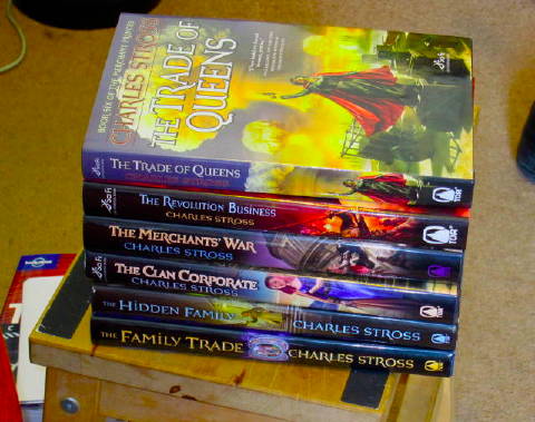
3) The Czech cover of "The Family Trade". I'm told half the bookstores in Prague misfiled it under "romance". (As I mentioned earlier, authors going ballistic over their book covers is understood. When their agent joins in, publishers take it more seriously. We got the subsequent covers changed.)
The author's photograph on the dust jacket ... I have a lot more respect for the modelling profession after being on the receiving end of a five-hour photoshoot around the arse-end of a decaying naval warehouse in Boston in mid-February (for the cyberpunkish ambiance, according to the photographer). I've heard apocryphal stories of the Bad Old Days when unscrupulous publishers would substitute a photo of someone more attractive if they felt like it, but I don't know anyone that's actually happened to. I will note that it's a lot tougher for women; men in DJ photos are allowed to look middle-aged and slightly unkempt, but given what the purpose of a book's DJ is, you can figure out the sexist syllogism for yourself.
The blurb on the back cover/inside front flap ... they're usually written by someone in marketing, although I know at least one major publisher where the commissioning editor writes his own blurbs and runs them past the author for comment. The goal of the blurb is to convert the person handling the book from a handler to a purchaser; nothing more or less. It does not need to reflect the content of the book accurately, although most authors get awfully itchy and irritable in the presence of actively misleading blurbs. It shouldn't spoiler the contents if there's an element of surprise: this is one good reason for publishers to show marketing-written blurbs to authors before running with them. But that's all. The blurb is an advertisement, not a plot synopsis.
The review quotes on the back cover/inside the front matter ... obviously, good reviews are gold dust. But you don't need good lemons to make lemonade. If Kirkus Reviews say of a hardback "this was an exercise in meretricious misogyny, stunning in the depths of it's depravity", do not be surprised if you subsequently see a back-cover quote like this: "Stunning — Kirkus". (In general, the longer the quote, the more likely it is to accurately reflect the review. But see above about the purpose of a book cover.)
The author's biography on the inside back flap is entirely their own fault, but I will note that publishers are under no obligation to print one. Nor are they going to put much effort into updating a bio they've used on previous books, so don't be surprised if bios are a few years out of date. Or decades. Or full of lies. Whatever.
Anyway, as should be obvious by now, authors have little to no control over what goes on the cover of their books, because book covers are marketing tools. And if you're of a nasty disposition and want to needle an author at a public event? Here's your pin.