We get book covers. We even get new book covers! Lots of new book covers! Which gives us a chance both to show off new books and to examine just how different publishers in different markets approach the art of cover design.
First up is the UK paperback release of The Rapture of the Nerds, by myself and Cory Doctorow. Lovingly produced by Titan Books, they've gone and excelled themselves with this great cover:

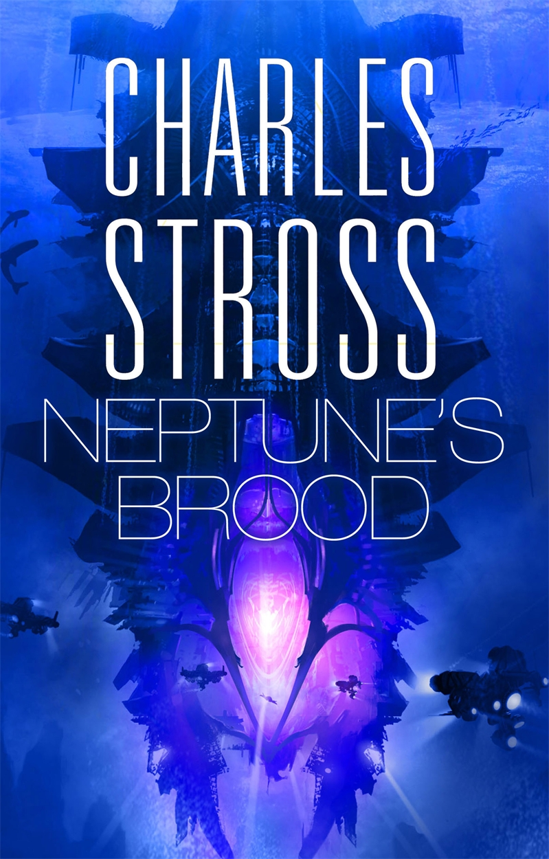
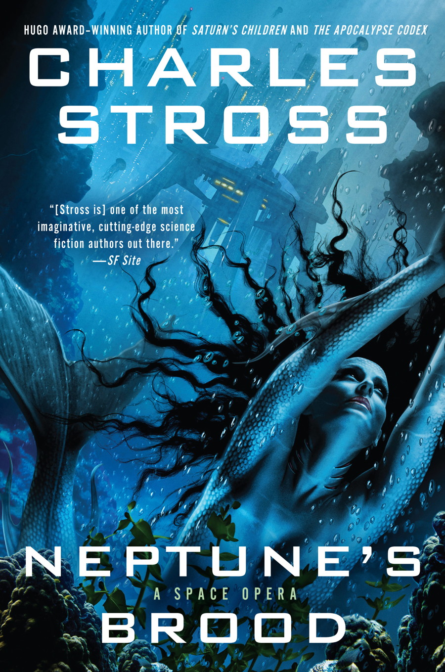
Second up, and exemplifying the way marketing strategies differ between the USA and the UK, are two covers for the same book — Neptune's Brood (coming on July 2nd, 2013; pre-order by following that link). Compare and contrast Orbit's kick-ass watery space opera (left) with the alternative design values implicit in Ace's US cover (right):
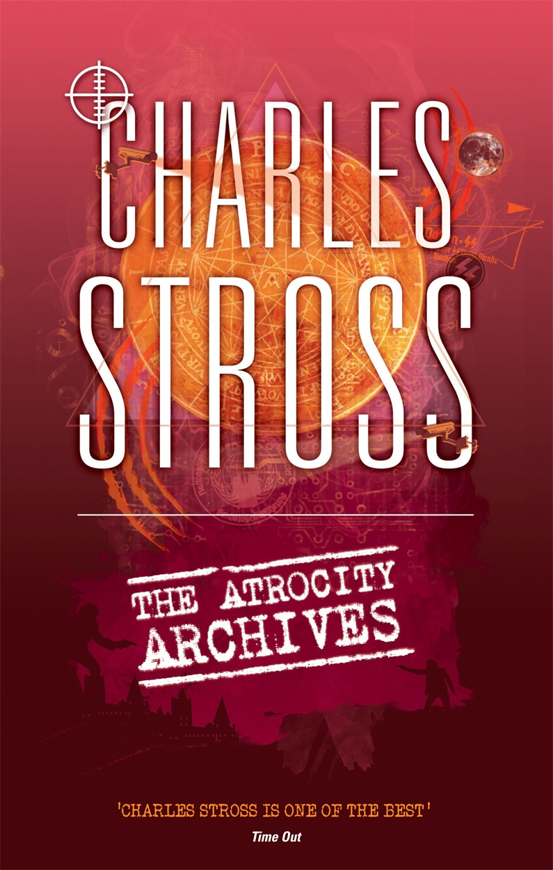
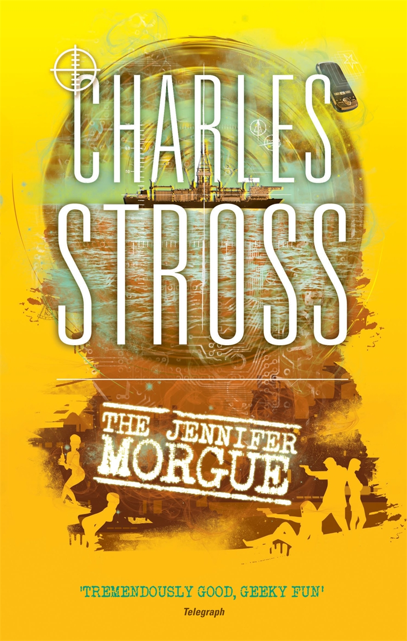
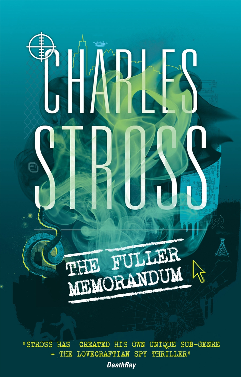
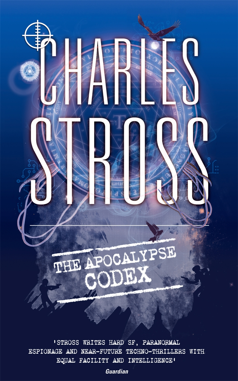
Third and finally, Orbit have redesigned and are reissuing the earlier Laundry novels, with an all-new cover design to give the series its own distinctive visual identity:
What do you think?

It's interesting how the US cover of 'Neptune's Brood' has to include 'A Space Opera' on the cover so people don't think it's mermaid erotica.
Not as bad as the US cover for 'Saturn's Children' though I guess. Although luckily I won't have to see either, I'm in the UK.
The Laundry covers look great - disguised as espionage genre novels :-) You might snag a few surprised new readers with those!
Neptune's Brood - I prefer the Orbit cover too despite the semi-nude halfbreed being featured.
The Laundry ones are good. I particularly like the way the cover artist was channelling Bond in the silhouette detail at the bottom of the Jennifer Morgue picture.
I like both the Neptune's Brood covers - I think I prefer the US "mermaid special" though, being an 70s-80s Jim Burns/Chris Moore/Philip Castle airbrush fan ;-)
Like the understated covers for the Laundry novels too - I always though the original paperback covers didn't sell the contents that well, dunno if that's true
one of the cover for the Atrocity Archive just looked like "Office Space with tentacles"
http://ideologyofmadness.spookyouthouse.com/wp-content/uploads/2012/07/atrocity.jpg
What do the Merchants War reissue covers look like?
I really dug the new Laundry covers. A needed redesign to draw them together (and avoid awkward questions when reading Jennifer Morgue in public). Although, something in me makes me think it is all an evil plot to make me rebuy books... [grin]
I do have to say I still prefer the Golden Gryphon versions of the Laundry books ..
But interesting to see the contrast.
I love the Laundry covers, too. But, even though I deliberately got the American edition of Saturn's Children (yes, for the cover!), I'm glad there will be at least one edition of Neptune's Brood that won't be embarrassing to look at.
Apart from the American need to have a (preferably female) human body on the cover, however, I also notice the fact that you're becoming a name-recognised author in the UK; usually, the author's name in font that big is spelled S-t-e-p-h-e-n K-i-n-g. Which is all to the good.
I liked the earlier (not shewn) "Rapture of the Nerds" cover ..... Like the new Laundry one, though.
One thing I noticed - since I first read this entry on my phone - is that many of them don't work well small.
For example the light weight title font on the UK Neptune's Brood cover almost vanishes. The Laundry books are nicely distinctive on colour - but the book titles are pretty much illegible.
Are we going to see separate covers for ebook editions at some point (do publishers still treat them as separate imprints?)
With the proportion of paper books sold online, and the amount of online sales that are - at least partially - coming from mobile - are we going to see cover designs tweaked so they work better across media?
(And you seem to have well and truly graduated to LARGE AUTHOR NAME. Congratulations. Was there cake? ;-)
All good covers. But, yeah, very different marketing strategies.
Both "Neptune's Brood" covers are decent. The UK cover makes me more curious about the book, but maybe that's me. At least the US version is somewhat subtler than the one for "Saturn's Children". Though if someone were to only see the NB cover with the hardcover of "The Jennifer Morgue" they might get the impression that you have a thing for merwomen.
And speaking of "The Jennifer Morgue" some of those silhouettes look like they belong on mudflaps. But otherwise all very nice, and good to see the series unified.
many of them don't work well small.
I asked my US editor about this. Response: "we're not optimizing our covers for ebooks yet". My take: never mind ebooks, Amazon's storefront uses thumbnails at 120x80 pixels! If the title and author name aren't legible at that resolution then it's a problem, because that's what casual browsers are going to see in the "if you liked X you'll love Y" reader recommendations.
Yes, ebooks are treated as a separate imprint. But so far there's no attempt to target them with separate marketing requirements. I'd love to see a publisher do A/B testing on cover design language to see what sells best ...
Sure but "if you liked X you'll love Y"" translates from AMZN to English as "Other people who bought X also bought Y" and ignores the fact that you've tagged "Y volumes 1 .. last-1" as not interested.
Damint, I like those new covers! But I'm afraid I won't be buying them all over again just so that my book shelf matches*.
*partly because I don't keep similar books together, and partly because I've run out of bookshelf and am back to strategic piles (of books)
For some reason I don't like covers where the author name is larger than the title. I understand why it is so - the book is new, the title is meaningless, and the author reputation is the only way to decide if it's worth buying...
Oh, wait, it's not what I actually do (or did, back when I visited bookstores). I just opened the book and read a dozen pages. That's what that particular marketing trick is just annoying to me.
Why do any of these have review quotes or explanatory text on the cover? Does anyone think actual consumers/customers will ever read these? As opposed to (say) marketing people in a meeting signing off on the design.
Agreed. I've seen the advice to optimize for online thumbnails for sales before.
Adrian's right, the Orbit titles are either too thin to read well (Neptune's Brood) or so small they blur into illegibility (the Laundry series). The last two of these are going to suffer the most, because they have the least amount of contrast between the white titles and the light-colored background.
Actually, I'm a little surprised that the art director for the Orbit covers didn't simply shrink the pictures down to thumbnail size before approving them. It took me about two seconds to check for thumbnail legibility, and even a massively overworked editor has time for that type of check.
While I'm vaguely annoyed by the Ace cover, it at least passes the thumbnail test.
Fortunately, I think they pass the red-green colorblind legibility test, although I haven't taken the time to simulate that.
If only the new Laundry covers had come out before I'd bought my mum the set. As a long-term Bond fan, my OCD gland would twitch like crazy every time they brought out yet another series of cover designs - you could never get the whole set to match. Mind you, OGH has yet to write fourteen Laundry files, die and then be replaced by a set of hit-and-miss authors, so no need to worry yet...
Also, the new Laundry files covers are a definite step up from the 'spotty' covers for the Atrocity Archives and The Jennifer Morgue - thy put me in mind of the cover of the Human Centipede... In other news - did the EU just enact the plot of Rule 34 in Cyprus?
I strongly prefer the Orbit cover for Neptune's Brood. After scrutinizing, however, I wonder if the same design values are present but more subtle.
I'm guessing you have no influence over this?
Really, book covers are the worst part about science ficion. Mosly hideous fonts, colours and pictures. And I'm really not picky with graphics and pictures, most of it just passes by unnoticed.
Why, yes. Yes indeed. For example, let's say that I'm browsing in a bookshop, looking for a book to fill a few hours of journey.
Suppose the book I first pick up is Hannu Rajaniemi's Quantum Thief. I've never heard of this guy with the weird name before, and my first reaction is "Hannu Who?". Sure, I check the cover, but ... hey, wait, it's got Charlie on the cover saying "This is good, this is great, this guy is so good I'm giving up from despair that I could ever be that good".
That's the point I don't put it down and pick up that Peter Hamilton volume instead. That's the point I check the opening page or two. That's the point where the writing has a chance to snag me.
It's all about hooks. Sure, Chris Brookmyre being quoted on one of Charlie's covers isn't going to make me more likely to buy something I'm buying already. But for giving something a slightly better first chance, yes.
(Exactly who is quoted is relevant. Certain authors are ... overly generous in their praise, shall we say?)
I'm guessing you have no influence over this?
Read this: Common Misconceptions About Publishing #6: "why did you pick such an awful cover for your new book?"
Thoughts of a certain USian lady who's typical blurb is "brilliant*3" pass quickly.
I don't like the new-style Laundry covers. They look pretty weak compared to the other covers those books have had - even the "spotty" covers that were around for a little bit. In fact, I might go as far to say that I hate the newer covers.
Now, I appreciate that the cover has to sell the book. And the cover has to sell the book from an Amazon thumbnail. But, dagnammit, I have to look at the book after I've brought it, and these busy, unclear designs do nothing for me. Also, the name "Charles Stross" is kind of hard to read when you look at the tiny pictures on Amazon (I just checked).
However, I bet these covers are dead cheap. I bet there's a master folder of "Stross/Laundry" assets somewhere in the graphic design department of Orbit. I love this series, but the soulless exterior is pretty boring when there is so much graphic design goodness that could be tapped for inspiration. Len Deighton covers? Dossiers? The circuit diagram for a 555 timer chip? Plain geometric shapes that would actually stand out as an Amazon thumbnail?
Just realized the reason I like the UK "Neptune's Brood" cover is it looks like a Martiniere--a favorite. Any idea who it's by?
If Orbit is reissuing the Laundry novels, is there going to be a chance to point out copy-editing issues, the way there were for the Merchant Princes novels?
(There were a couple of things in the Fuller Memorandum that bothered me, even though I greatly enjoyed the book as a whole.)
My OCD is twitching on the Laundry covers. How come the titles on three slope upwards, and Jennifer Morgye slopes the other way? Looks very odd to me
Nope, this is just a cover fix and re-print. What you're asking for is full-on retypesetting. Doesn't happen often.
Ok. I was thinking about the Saturn's children one, but at least you tried. The general state of SF covers is just bad taste I guess. And of course it's clearly identifiable as SF, but still... Seldom fits the actual text.
Greetings. I lean towards petehindle on this. From the selection of covers I only read the laundry files so my humble opinion on them only:
If your goal was to give them a more serious and "Bond"'ish style you succeeded. It also becomes more obvious that all books belong to a series and the color coding works. period.
However, in my opinion the cover and its elements only get meaning when you know the content of the books after reading. So I doubt that the "quick glance"-customer notices the small teaser symbols and buys the book on those grounds. Also, I always enjoyed the fast changes in the stories between weirdness, being halarious and the techno-demonological scariness. For my taste the new covers are a little too grounded - perhaps it is the subtle lovecraftian element that i miss. The pentagram medaillon doesn't transport this lovecraftian message enough and in the sense of continuity, a variation of that symbol is certainly missing on the cover for the jennifer morgue.
Would love to read some stats on sales pre and post-cover changes though! ;) Cheers and keep on writing - love you style.
Sorry. Meant the pentagram medaillon on the fuller memorandum.
Isn't glowing neon text on a black background a bit Geocities circa 1995?
hahaha,
as well as your covers and books I like your internal links:
/mermaid_boobies-large.jpg
I'd say the Neptune's Brood U.S. cover is a vast improvement over the U.S. Saturn's Child. I'm a librarian and I cannot bring myself to ever recommend that poor book simply because of the cover. I'm not a prude, but it's just... embarassing.
Speaking of author blurbs, my favorite is Dylan Thomas's blurb about Flann O'Brien's At Swim-two-birds, "This is just the sort of book to give your sister, if she is a loud, dirty, boozy girl."
You lucked out. The US Neptune's Brood cover is a lot nicer than the US Saturn's Children cover, and the re-release Laundry covers look (to me) much prettier than the original US release Laundry covers.
I have a soft spot for the white and green Rapture of the Nerds with the grey exploded schematics, though. However, it wouldn't make a good paperback cover.
I like the new Laundry Files covers a lot (although I had nothing against the original covers). Not sure how well they'll work as thumbnails, though.
The final of the fish tits cover is certainly better than its first draft, although it still looks as if it belongs on one of my books rather than one of yours. Oddly, as a piece of cover art, at that size I prefer it to Orbit's version (at full cover size I'd prefer Orbit's) -- it's easier to see what it is, even if what it is is rather misleading.
I concur with a number of other comments.
The US Neptune's Brood is much better than the cheesy Saturn's Children was. It is still a little coy with the strategically placed fig leaf...er "seaweed".
I like the US cover. I suspect the very cool, hazy blues are a bit of a problem regards getting attention. I must say the Orbit picture appeals to me more, and the mix of hot and cold colors and implied sense of scale is very cool. (I may even order that version).
I also have a major problem with the Orbit cover typeface for the title. It will certainly disappear when the audiobook is eventually released.
Does the US title really need the addition of "A Space Opera" plus the SF Site endorsement? It is getting to be classic marketing overkill - like oversized, moving graphics on tv announcing the "next great series not to be missed, tomorrow night at 8", when you are trying to concentrate on the show.
I have to say, the UK cover bears a more than passing resemblance to the Leviathans in Mass Effect 3.
Does the US title really need the addition of "A Space Opera" plus the SF Site endorsement? It is getting to be classic marketing overkill...
At least they didn't label it as by Charles "An Author" Stross. Apparently Americans are thought to need more text on their book covers.
I'm slightly in favor of the mermaid cover, mostly because the UK cover at first looks like abstract geometry on my monitor; the US version better communicated an underwater setting. (But there should be an actual mermaid in the story.) On closer examination I see the UK cover shows an underwater...big thing, but this brings us back to the thumbnail question.
Love, Love, LOVE the new Laundry book-covers! I continue to evagalize this excellent series and always get mighty thank-yous from friends and colleagues when they start reading them and fall in love with them!
Never judge the book by the cover, but I'm buying the mermaid version. I mostly prefer non-abstract SF book covers. Cover of Saturn's Children was maybe too provocative, but I think it's really nice.
You're not the only one! What's special about "The Jennifer Morgue"? Is it because it's the only one so far that's featured the ocean depths? (Going down...)
OTOH, I like the new unified cover theme for the Laundry novels. OTOOH, I'm unlikely to buy the new versions; I already have the older ones in HC.
Does it need to say "a space opera" on it? Of course it does.
While nobody really seems to agree with me on this, covers are how most books are judged. You have a split second to reach the browser with author, title, and art and it all happens in a second or two. Name recognition is great but new readers won't have that going in, they'll just have the title and the picture. And if you're trying to sell into a genre, there are certain things you can do to let the reader know what's in the tin.
The space opera isn't quite clear from the title, Neptune's Brood could mean just about anything. Doubtless it will make sense in the context of the book but we're talking snap impression from a cover here.
I know Charlie hated the new title but I thought Singularity Sky got the idea across rather well before I'd even gotten to the blurb. Also loved the American cover art with the godlike light from the clouds and barely-visible spaceship. I didn't know much about the story going in but it was enough to intrigue me, I wanted to know more.
I like what they were trying to do with the Laundry covers but there's not enough contrast between light and dark to make out the shapes clearly. It might pop better in print but is a mess electronically. I'm having to zoom in and squint to see things.
I do think we'll eventually see a trend towards the general simplification of book covers, to create unified campaigns across all media. Doubtless, there will be complainers. Old-time fans decried the death of proper album art as music went from LP to CD. The art got even worse as things went digital. Still, progress marches on.
I always thought a great alternative take on the Jennifer Morgue cover would have been something like the Octopussy poster for James Bond, only not all the arms sticking out are human, or arms. But that's so obvious it's probably been done before.
From what I understand of things, as far as book cover art goes, writers have an "artistic privilege" clause which allows them to choose the style and colour of the necktie they're wearing when the cover art is presented to them by marketing (to mangle a Woody Allen quote somewhat). Or in other words, there's little to no control over it exerted at the authorial level aside from being able to say "yuck" to truly egregious horrors (and have them implemented by marketing anyway).
My only critique of the Orbit Laundryverse covers is that they've really painted themselves into a corner colourway-wise - they've covered the full spectrum in just four books, and left themselves nowhere to go with the next one.
I always find it interesting to compare US and UK market artwork for book covers, particularly in the light of campaigns like those of Jim Hines and things like "the Hawkeye Initiative" over on Tumblr regarding the ridiculously over-sexualised postures things like book cover art and comic book cover art place female characters in. The hyper-sexualised (to the point of apparently having no working spine or internal organs) female figure on the book cover seems to be a largely a US thing - UK covers for the same work tend to be much more abstract. Different design aesthetics in different markets, I suppose.
Anyway, the mermaid on the "Neptune's Brood" cover is neatly figleafed by seaweed, and has the author name and "A Space Opera" text carefully covering the nipple area so she doesn't offend the ultra-fastidious. It's hard to tell, from looking at the cover, whether she's actually fitted with a workable spine, but at least she's not in the typical, spine-twisting "tits and arse in the same shot" pose. Are there any plans for a Jim-Hines-esque rendition of the cover art with the author as merman in aid of charity?
That cover for Neptune's Brood? Reminds me of Realms of Fantasy cover.
Hmm, well if editors still aren't optimising for how it looks on Amazon, rather how it looks in a mythical (closed) bookstore, then someone needs a slap upside the head.
High contrast, high saturation, big fat type seem to be the order of the day. Perhaps surprisingly none of them seem to have picked up on the 'pop' of a teal/orange colour scheme, as seen in your standard hollywood blow-something-up bubblegum movie.
As for multiple covers, multiple classifications/demographics - you would have thought the Rowling kid/adult covers would have clued them in; much cheaper and easier to achieve with eBooks.
Seems to me there is a market for the A-B testing, computer mediated, adaptive book cover. I wonder if someone has a patent application in on that? Apple or Amazon?
As for the covers you've been saddled with? Rapture is the best. The Neptune's Brood examples are too fussy, indistinct - even Mermaid Boobies. And as for the Laundry covers - they say almost exactly nothing to the Amazon viewer, other than that they are a set. "The Jennifer Morgue" is particularly bad, my eye keeps getting drawn to the old fashioned mobile phone floating top right for no obvious reason.
Decisions, Decisions! I did have "Neptune's Brood” on order from Amazon US of A on the grounds that USian Hardbacks are usually better made that British Hardbacks - small press editions excepted of course - but seeing the two covers side by side like that ...the American cover is actually insufficiently Generic S.F. If you are going to go that route then why not go all the way Over The Top with the Mermaid clutching a bloody enormous Ray Gun which would serve to hide those ever so offensive nipples ... and anyway where are the sharks with laser cannons? I'm almost certain that we were promised Sharks With Guns.
No, it just won’t do and so I've cancelled the American order and ordered “Orbit’s kick-ass watery space opera” that doesn’t feel the need to announce that it’s a "Space Opera”
Is it just me or does the orbit version of Neptune`s Brood look rather similar to a lady's... region. Either that or I need to get out A LOT more. Kind of puts the mermaid boobies one into perspective.
Dammit! Why did you have to mention that? I can't not see it that way anymore.
Don't be silly, it's actually inspired by Georgia O'Keeffe.
Gahhh! Why can't cover designers ever learn that having clear letters on a dark background (instead of dark letters on a clear background) reduces visibility by several degrees. Sure, they made the letters bigger to compensate but it's still not enough. The worst though is "clear on clear" as demonstrated here by Orbit's The Jennifer Morgue.
Is it just me or does the orbit version of Neptune`s Brood look rather similar to a lady's...
I have no emoticon for this. I will now not complain about the fish tits. Good night.
I'm looking forward to the content. Any of the covers will do fine, thanks.
If covers are all optimised for what it looks like on Amazon, all we will ever get is the author's name in big letters, and the title. In a crisp typeface that reduces well.
Completely different designs are needed.
there's little to no control over it exerted at the authorial level aside from being able to say "yuck" to truly egregious horrors (and have them implemented by marketing anyway).
Exactly.
The smaller the publisher the more say you get. With a big publisher, such as Ace, Orbit, or Tor, you get the chance to bloviate and if you can remain coherent while explaining why in marketing terms a specific cover feature is a bad idea, they may listen to you.
The US "Neptune's Brood" cover is a case in point; I've given up trying to argue on the artwork, but was able to point out that the initial choice of typeface was barely legible even at book size, and utterly useless on the web. So they changed it, to what you see here (which is a vast improvement: also consistent with what they used on some of my other hardcovers).
The trouble with A/B testing is that it costs money and time. You can only really deploy it where the potential profits from, say, a 10% uptick in sell-through is going to justify the work of preparing a second cover and setting up the test. And for most anything short of a novel from an A-list author that is hopefully going to go bestseller, the profits to carry the work just ain't there.
And then we hit the next snag. Books are sold as SKUs identified by an ISBN specific to the binding and distribution mechanism for the channel in question. That is, a hardcover has a different ISBN from a trade paperback or mass market paperback of the same book. Bookscan, from which bestseller charts are compiled, tracks book sales by ISBN of the item sold at the cashier's desk. To do A/B testing you'd have to issue two different ISBNs (or ASINs on Amazon). This splits your sales figures, thus almost guaranteeing that your hopefully-going-to-go-bestseller title won't make the charts.
There are no sharks with lasers strapped to their fricken' heads in "Neptune's Brood".
Communist space squid, sure. Space bat pirates, hell yes. Flying churches crewed by animated skeletons? Yup. Mermaids? Just possibly. But I couldn't find a corner to cram the sharks into.
Pity, that. A sea/undersea novel without prowling sharks is like a P.I. thriller without dangerous blondes or a romantic novel without dark, brooding men.
You'll get no disagreements from me - physical is different from onscreen. If you are designing a poster for a movie or a TV spot you don't use the same designs.
Which brings us to the question of whether sticking a copy of the book cover is really sensible for advertising a book, or if, maybe, animation/video might be better.
Charlie,
Don't think you quite got the idea I was aiming at - which suggests that maybe it is a little bit smarter than I thought.
Selling online, particularly eBooks, means the physical print, and it's limitations, don't matter so much.
eg the picture of a cover is a changeable advert, nothing more.
As a matter of interest, do we have any up to date figures on how many books are sold via physical bookstores, via online stores (like Amazon), and as eBooks? I'd have expected the eBook growth rate to have slowed by now, but physical bookstores to be on its last legs as far as sales percentage goes.
No, I got what you meant.
Trouble is, ebooks are currently just a content distribution channel, both from the PoV of the publishers and the booksellers -- even the ebook-only ones. And the constraints of the channel dictate how you go about selling through that channel.
Also, don't underestimate how marginal 99.99% of books are, as commercial products -- the cost of doing animation for covers would easily dwarf the entire marketing budget for a typical midlist novel (call it US $2500-5000, including print ads in the trade press read by librarians and bookstore proprietors which is generally invisible to the public).
Ebooks ... I don't have up-to-date figures, and in any case they vary between countries quite remarkably. Germany and France both have retail price standards for books, and ebooks are not only sold with DRM but can't legally be sold at discount, so ebook sales in those markets are pitiful compared to the UK. The UK is following the US in ebook adoption, but 18-24 months behind (as usual). The US ... it varies by genre. I can say that "Rule 34" sold 40% of its first three month sales in ebook, although that might have reflected an unusually tech-savvy market combined with an ebook that was significantly cheaper than the hardcover. At the time, 20% was expected. I reckon I reached 40-45% ebook sales across the board last year in the English language markets; some sectors may be higher (e.g. computing industry books, SF, some corners of Romance) or lower.
The point is, ebooks are currently supplanting mass market paperbacks in the "disposable reading" niche. Instant gratification, low price, no expectation of re-reading (by most customers) -- that's what paperbacks were about. Ebooks add "always available, never out of stock, free samples often available" on the consumer side. On the publisher side they promise "no supply chain issues, no returns, never need to rush to reprint, can follow up viral word-of-mouth success with marketing push in real time rather than waiting for a printer to catch up". That's why the big
sixfive suddenly started paying attention about 5 years ago: the advantages began to sink in.I reckon we're still only in the first phase of the ebook revolution. After the death of the mass market paperback, the ebook channel will stabilize. Then some clever git will figure out how to disrupt the ebook channel by installing a second, parallel, ebook channel with different contractual and distribution constraints that allow new and innovative sales methods -- price discrimination, for example, or animated GIF covers, or sane author/publisher contracts that hit the reset button on 150 years of legal boilerplate cruft. Hell, maybe a publisher who does that could even turn into a Kickstarter publisher: publication date tracks customer orders rather than distribution channel dates, when advance orders exceed break-even plus a profit threshold, book is released without DRM or with extra value-added content of some kind.
What strikes me about the Laundry covers is that they seem designed to minimize any first impression of fantasy, and to help enable a crossover into straight thriller.
A/B Cover testing is obviously a great idea, but it would require some assistance from the vendors to do properly. One more reason for publishers to regard their web sites as vehicles for more than trade communication- although Tor is leading the way there as in so much else.
Owwwwwwwwwww ;-(
that's put me right off it - still, naked mermaids on the cover...;-D
You realise that by the time the future that is Neptune's Brood comes about, strapping lasers to sharks' heads will be totally, crudely, primitive. You'll notice that Charlie didn't deny the presence of sharks with implanted lasers.
Implanted lasers? Given the mermaids I'd expect them to be genetically modified to grow their own lasers.
I shall take note of that. I already have a clean-jawed young seaman on the run from the Secret Police, though the dangerous blonde is a redhead, and an intrepid aviator.
Sharks. Nobody has invented lasers yet.
Is this a good time to remind you that at one point in the 1930s it was thought that radar might be capable of being used as a "death ray"?
Actually - I was thinking that the obvious place for doing a/b testing wouldn't be at the level of actual book covers distributed by publishers - but at the on-line distributor.
Don't have different editions of the book. Have different "product shots" at the Amazon, etc. level.
In fact, outside of books, I've noticed on several occasions what looks like companies selling the same product at the same price but with product shot / copy variations on Amazon.
For example - there's nothing stopping Orbit doing some split testing on those cover images at the top of http://www.orbitbooks.net/ for example.
What works better - their current mock book, a flat of the cover, a tight crop on the title/author, a tight crop on the imagery, etc.
I assume there must be some links there somewhere that go through to something that can be used as a half way decent stand in for revenue.
Yes - it's expensive chunk out of an individual books publicity budget (or lack thereof). However if - for example - you see tight crops on the author name & book title start getting more click throughs in general you have some very interesting info that you can feed into general cover design guidelines - or at least the cover gfx you release to online stores.
If I were a publisher I wouldn't be thinking of it in terms of helping an individual book's sales. I'd be thinking about it in terms of figuring out what works / fails in general so I can start optimising across the board.
Personally, my money is on mutated Sea Brass. Ill tempered, of course...
BTW, any motivational concerts like in NOLF?
any motivational concerts like in NOLF?
Uh, what?
Well, I thought it'd be nice to enlarge the mutational meme pool somewhat after Austin Powers with bringing in the computer game "No One Lives Forever", or NOLF, as it was known in our local random tag of misfit nerds at the time.
http://tvtropes.org/pmwiki/pmwiki.php/VideoGame/NoOneLivesForever
It seems one Inge Wagner was strangely gifted in the vocal way.
Space bat pirates, hell yes.
Man, those alien space bats really get around.
they certainly do
http://www.counter-factual.net/upload/forumdisplay.php?f=25
the Wehrmacht couldn't have invaded Britain in 1940 without them....
The Orbit covers for the Laundry novels make me think of the Gollanz minimalist masterpieces. A second look almost banishes the idea, but the impression still lingers.
I have, in my time, produced a few CGI images which might work as base for a book cover that is to be shrunk by Amazon. I tend to see the picture set-up, arranging the models in a virtual scene, as something like studio photography, and that maybe influences some of my visual choices, such as a plain background and a strong large-scale pattern.
There are weaknesses in the infamous "Saturn's Children" cover, but it does have that large-scale pattern.
No, I don't think I do a good job. I don't create my own models. But I am not blind.
When books are part of a series I like the cover to reflect which volume I'm holding. For instance, somewhere on The Jennifer Morgue the cover should say, "Book Two of The Laundry Files novels." Admittedly the series isn't really that sequential, and there's a good synopsis worked into each one, so you COULD just pick one up and enjoy it, but it can annoy to get a later book in a series unwittingly, no matter how well handled. If they are going to be color coordinated to obviously go together, my reaction, on seeing them in a bookstore (from what I remember) would have been, "OK, cool, a series, so there's lots if I like it. Where's the first one?"
Apparently notes such as "Book foo of the Bar series" are now considered unacceptably convenient for readers. The Laundry Files aren't particularly confusing, but imagine someone trying to find a jumping-on point in the Honor Harrington series.
Intriguing article with picture links to the various covers to "Rapture of the Nerds" documenting the creative process to the final version. Some of the discards are very good too.